This site is currently in BETA. Help us improve by giving us your feedback.

UoS Library Data Lab
  • Home
  • Datasets
  • APIs
  • Examples
  • About and Contact

On this page

  • Visualising Sentiment in the Play “The Demon Monk”
  • Using Excel Pivot Tables to Visualise British Official Publication Dates

Examples

Visualising Sentiment in the Play “The Demon Monk”

During her professional placement with the Digital Scholarship team, part of her Master’s programme in Archaeology, Yifan Zheng explored data from our digitised collections. She focused on materials from the Rosicrucian collection, which contains publications of the Rosicrucian Order’s Crotona Fellowship.

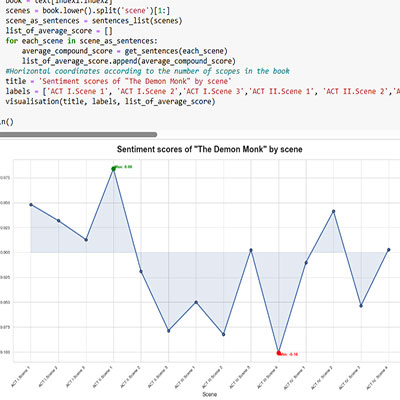
Yifan used an API key to access the full text of a play in the collection, saving the text to a file for ease of use offline. She used a Jupyter Notebook to break the text into acts and scenes. Each scene was further broken into sentences that were analysed using the Natural Language Toolkit (NLTK) to obtain sentiment scores. The sentiment scores can be between -1 and 1, a score above 0.05 is positive, a score below -0.05 is negative and a score between -0.05 and 0.05 is neutral. By averaging the sentence scores within each scene, she produced a sentiment score for every scene in the play.

Finally, Yifan visualised these results using the matplotlib Python library, creating a graph that highlights how sentiment shifts from scene to scene throughout the play.

Sentiment scores of "The Demon Monk" by Scene showing mostly negative sentiment

Yifan’s notebook is available on GitHub.

Using Excel Pivot Tables to Visualise British Official Publication Dates

Using the British Official Publications dataset, a member of the Library’s Digital Scholarship team demonstrated how Microsoft Excel can be used to prepare and visualise data.

After downloading the dataset the british_official_publications_descriptive_metadata.csv file was imported into a new workbook. The data were cleaned and prepared using the Excel Power Query Editor, which involved removing unnecessary columns and standardising the format of publication years.

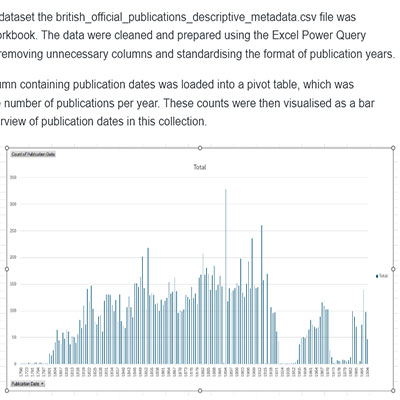
Once cleaned, the column containing publication dates was loaded into a pivot table, which was configured to count the number of publications per year. These counts were then visualised as a bar chart, providing an overview of publication dates in this collection.

Bar chart showing count of publication years


  • Accessibility Statement